
Rela Hospital - Web Experience & Patient Portal
The overhaul of Rela Hospital's online interface led to a substantial decrease in the bounce rate and a remarkable 3.87-fold increase in overall website traffic.
Enhancements to the appointment booking process through a patient portal also yielded an impressive 87% boost in web-based patient conversions.
ROLE
Lead UX Designer
DURATION
Feb’22 - Jul’22
TEAM
Project Manager (1), SEO Analyst (1), Content Writer (1), Developers (2)
I was the Lead UX Designer of this project, responsible for User Research, Stakeholder Interviews, User Journey Maps and Ideation. Based on my research, I developed the revised wireframes and high-fidelity mockups.
CHALLENGE
Growth in a very short span of time gave the hospital a ton of issues to solve rapidly, thats where we intervened.
The hospital aimed to digitize its manual services promptly, but encountered a significant challenge: the current website lacked the capacity to expand and integrate the new features sought by the client.
87% of users stop moving forward when looking for a specific doctor or department on the website. Summary of 150+ survey responses on online appointment booking indicates a widespread lack of trust in the experience.
OPPORTUNITY
For the Business
-
Digitize Operational Processes and Centralize Patient Records
Transitioning appointment booking to the online patient portal, ensuring unified access to patient records.
-
Scale Up Non-Branded Traffic Increasing the overall exposure of the healthcare institution and its services.
-
Achieve a 40% Improvement in Web Conversion Rate
Optimising user experience, implementing effective call-to-action elements, and refining the online journey.
For the User
-
Enhanced Usability
Simplify navigation tailored to individual user journeys, making it easier for users to navigate and interact with the platform seamlessly.
-
Build the trust back.
Implement content design that demonstrates Rela's genuine concern for patients, aiming to rebuild trust among users
-
Optimize Customer Touch points
Harmonize the design system and visual language across all customer touch points on the web, ensuring a cohesive and consistent user experience aligned with the brand.
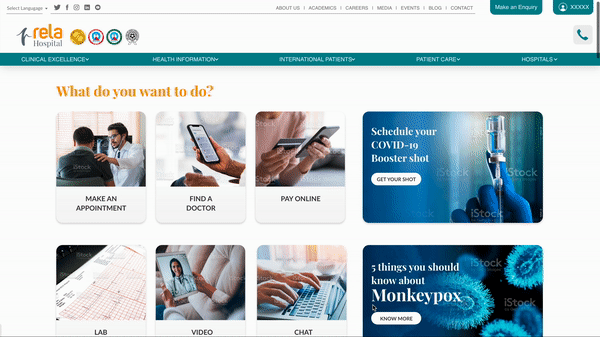
The Original Website
The 'Why Rela?' aspect could be better emphasized through statistics/numbers.
Does not provide information on the hospital, rather touches info tangential to the brand's positioning.

New Features were stacked up on the header, with very less coherence in the Home page.
8 full width banners on the Home page (web/mobile) increased the loading time of the website significantly
Images of events and announcements did not drive the UX towards captivating a user's attention. The existing content doesn't create an experience to drive actions.
RESEARCH METHODOLOGIES

Website Audit
Usability Studies

User Interview

Competitor
Analysis

Stakeholder Interviews
DISCOVERY
The Menu items are an exhaustive list of all the Departments of the hospital without any categorization, hence users frequently get lost while navigating.
"I forget what I was searching for every time I open the menu. Does the pulmonary department treat lungs or kidney?"

USER JOURNEY MAPS
Categorized the users based on the traffic in the existing website

RAPID RESPONDER
A rapid responder is usually a caretaker of a sick patient, looking for hospitals in the neighborhood. They are usually in an emergency situation, actively seeking for medical services in their locality.
From this part of the world -
In and around the city, state. Other countries where the brand name is popular.
Seeking information about -
Healthcare services, facilities of the hospitals, doctor profiles, experience, credibility of the hospital. People who are in immediate need of any healthcare service like surgery, lab test, or health checkups and periodic hospital visits.
Intention to visit the hospital -
75% and above. The intent is very high in this category, ease of booking appointments and other services, remembering the users, data and creating habitual behavior for the users can result in good engagement and retention.
Important pages accessed in the website -
(in the order of)
a) Doctor Profiles b) Transaction Page c) Department pages
d) Treatment and procedures e) Home Page f) Health Packages
User Journey Map of a Rapid Responder who is in an Emergency
TIME
Emergency
LOCALITY
Book an Appointment
Book a Lab Test
DECISION

DIAGNOSIS DETECTIVE
Patients or caretakers seeking for information on long-term symptoms, and treatments. Primarily referred by a medical professional. Looking for documentation of credible information and experiences about the treatment, doctor or the hospital.
From this part of the world -
Anywhere in the world + Stronger conversion with users from India and specifically Tamil Nadu
Seeking information about -
Symptoms, specific illness/health conditions, Doctor profiles, treatment and procedures. People experiencing mild symptoms, or caregivers of people experiencing mild symptoms. Looking out for more information regarding any specific illness, or health conditions.
Intention to visit the hospital -
Below 30%. The intent is moderate in this category and the right information in the right format can result in a good number of conversions
Important pages accessed in the website -
a) Treatment and procedures b) Diseases and Conditions c) Clinical Articles d) Doctor Profiles e) About Pages - Infra, Awards, Locations f) Home Page g) International Patients
User Journey Map of a Diagnostic Detective who wants to take an informed decision
TIME
Not an Emergency
INFORMATION
Doctor Profiles
Facilites & Infrastructure
Procedure / Treatment
Hospital Reviews
QUERY
Appointment
Cost
Second Opinion
TRUST
Awards, accredations
Facilities and Infrastructure
FINANCES
Insurance / Bills
DECISION

WELLNESS SEEKER
Health enthusiasts, who are actively looking for content online, regarding healthy lifestyle, clinical transformations, innovations in treatments and seasonal illness.
From this part of the world -
Anywhere in the world
Seeking information about -
General research - (Health conscious + mild symptoms), blogs, clinical articles,
seasonal diseases, healthy lifestyle tips
Intention to visit the hospital -
Below 10%. People who are highly health conscious and are aware of their body and symptoms, follow health-related blogs and resources consistently. The intent is very less in this category.
Important pages accessed in the website -
(in the order of)
a) Healthy lifestyle blogs b) Generic blogs c) News articles, events and media
d) Clinical Articles e) Home Page
User Journey Map of a Wellness Seeker who likes to be aware of healthy living
INFORMATION
Wellness Blogs
Clinical Articles
Pandemic
Epidemic
Chronic Illness
Seasonal Diseases
Symptoms
Best Practices
Healthy Habits
DESIGN OBJECTIVES
We identified our objectives based on the user research, stakeholder interviews and existing functionalities, into three main design considerations.
Seamless Navigation
The navigation in the website was revamped to provide a smooth and effortless experience for the dynamic user group with any motive.
Transaction with Authentication
Authentication measures were implemented on all transaction based user journeys to enhance the credibility of the institute.
Connecting through content
The content was modified to shift the tone to "We (Hospital) are here for you" to establish stronger connections with the target audience.
SOLUTION


Navigation
Is not a puzzle anymore
THE NAVIGATION
The Navigation from the Home Page, was made very direct and simpler. So, any user visiting the home page, will be able to get to their respective destination page without any confusions. The navigation branches were divided into different touch points such as, Information, acquisition and retention. This helped while prioritizing the positions of the elements.
The new revised navigation is anticipated to reduce the overhead of customer support services.
The consistency in the forms is expected to improve the trust for users to fill their information, which will boost the conversion rate through forms.
THE FORMS
The different kinds of form in the existing website was redesigned to follow a single layout, that was intuitive and interactive. The repetition of the form layout at different pages is intended to reduce the cognitive load on the user.


THE LOGIN AND TRANSACTION PAGES
All the CTAs were nested to the header of the new website for easier navigation. Further, the transactional features were designed to be protected within a User login that improves,
-
Sense of Data Security for any user
-
Remembers and restores the data of a returning user
-
Improves the website experience with more visual content
The login feature and the transaction page is envisaged to improve the retention of existing users.
REFLECTIONS
Persuasive Communication is the key.
This project let me experience the challenges that comes along working with a very diverse group of stake holders. The redesign of the website for this fully functioning Health care institute influenced the lives of many heath-care professionals at different levels of services. Communicating the need for bringing the necessary revisions to the client on the way was a crucial part of the process.
Structured Research is pivotal.
The data gathered to understand the status quo of the Health-care Institute and the role of the website was the pivot of the project. Being an intuitive designer by nature, it was a challenge for me to overcome the existing biases and truly investigate the scenario. I recognized the effectiveness of structured research in a large scale project during the course of this project.